
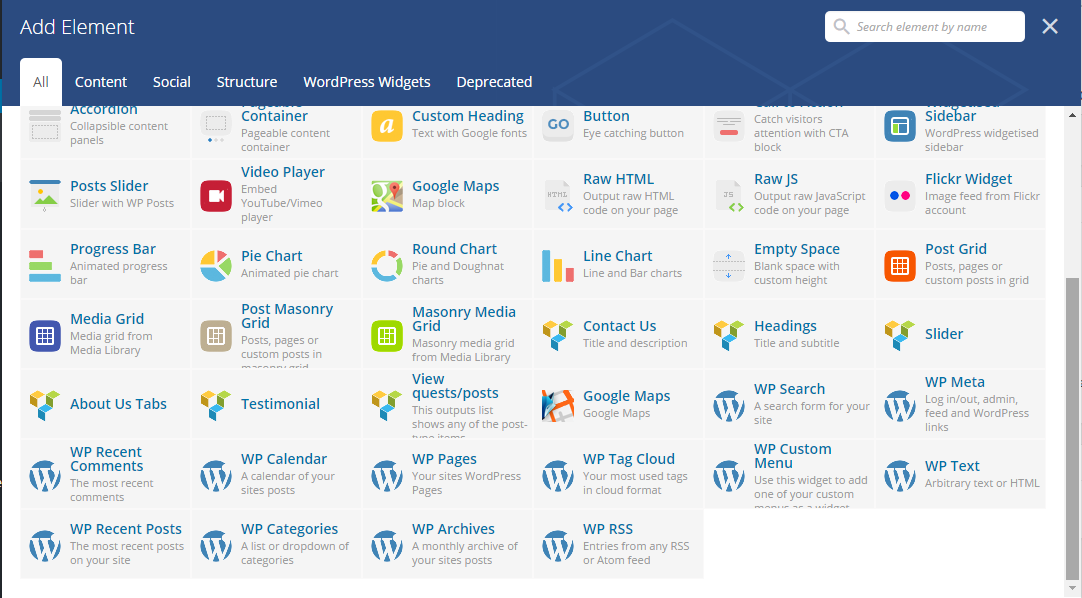
The theme comes with a number of shortcodes allowing you to add the info where you want the relevant content to show up. In addition, you can use Visual Composer to add new elements to the page in a simple way.
 Slider

The shortcode is a parent one, which means you would need to add a parent and
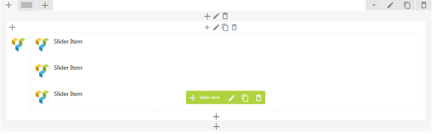
Parent
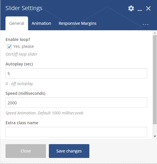
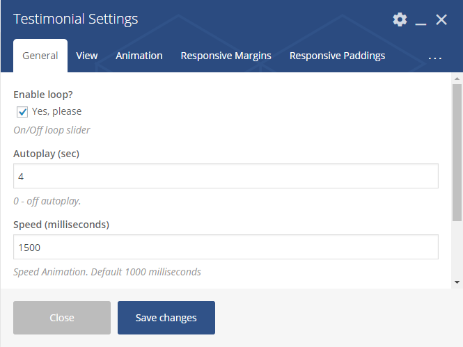
- Enable loop – enable/disable loop slider
- Autoplay – Allows
autostart playback. The value can be in seconds.If 0 – autoplay is off. - Speed – speed animation. Default 1000 milliseconds
- Extra class name – class name for
element . Allows to set up additional decorations forelement in CSS stylesheets.
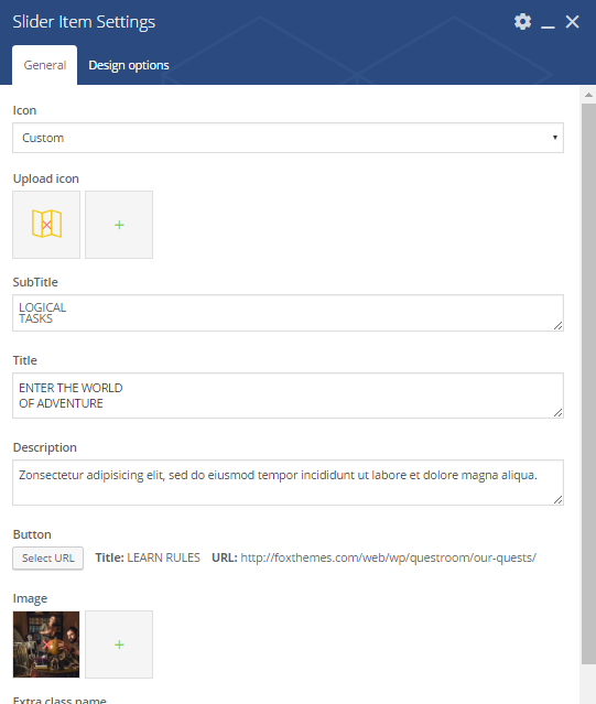
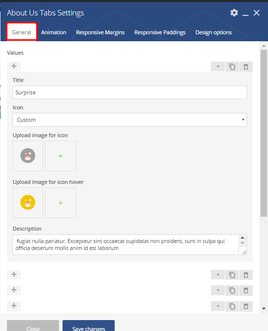
Child shortcode parameters:
- Icon – the icon type. It can be one of the following types: custom or default
- Upload icon – if custom type selected in the field
abowe , upload an icon form library - Subtitle – the subtitle for slider
- Title – the title
for slider - Description – a short description of the slider. Displayed under the title.
- Button – title and the URL where the link from the button leads to.
- Image –
class name forelement . Allows to set up additional decorations forelement in CSS stylesheets. - Extra class name – class name for
element . Allows to set up additional decorations forelement in CSS stylesheets. - Animation on scroll – a type of the animation on scroll
- Duration animation – continuance of the animation
In Animation section
Headings shortcode

In Animation section
View guests/posts
Parameters:
In Animation section
About Us Tabs shortcode
Parameters:
In Animation section
Testimonials
Parent shortcode:
 Child shortcode parameters:
Contact us shortcode
 Parameters:
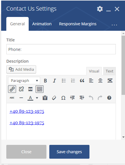
- Title – the Contact`s title
- Description – a short description regarding contact details
- In Animation section
- Animation on scroll – a type of the animation on scroll
- Duration animation – continuance of the animation
Responsive margins
- Large desktop margin top/bottom – set margins for the
large desktop screen. You can select an appropriate value from thedrop-down list. - Medium desktop margin top/bottom – set margins for medium (laptop) desktop screen. You can select an appropriate value from the
drop-down list. - Mobile margin top/bottom – set margins for the
mobile desktop screen. You can select an appropriate value from thedrop-down list.
Responsive padding
- Desktop padding top/bottom – set padding for the
large desktop screen. You can select an appropriate value from thedrop-down list. - Medium desktop padding top/bottom – set padding for medium (laptop) desktop screen. You can select an appropriate value from the
drop-down list. - Mobile padding top/bottom – set padding for the
mobile desktop screen. You can select an appropriate value from thedrop-down list.
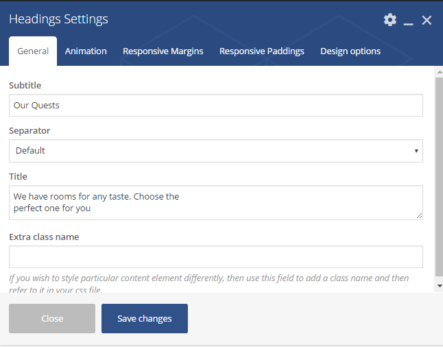
-
- Subtitle – the heading`s subtitle
- Separator – a dividing line. It can be one of the following values: default, custom, none. If none – separator will be disabled
- Title – the Headings title. Displayed under the separator
- Extra class name – class name for
element . Allows to set up additional decorations forelement in CSS stylesheets.
- Animation on scroll – a type of the animation on scroll
- Duration animation – continuance of the animation
Responsive margins
Large desktop margin top/bottom – set margins for
large desktop screen. You can select an appropriate value fromdrop-down list.Medium desktop margin top/bottom – set margins for medium (laptop) desktop screen. You can select an appropriate value from
drop-down list.Mobile margin top/bottom – set margins for
mobile desktop screen. You can select an appropriate value fromdrop-down list. Responsive paddingDesktop padding top/bottom – set padding for
large desktop screen. You can select an appropriate value fromdrop-down list.Medium desktop padding top/bottom – set padding for medium (laptop) desktop screen. You can select an appropriate value from a
drop-down list.Mobile padding top/bottom – set padding for the
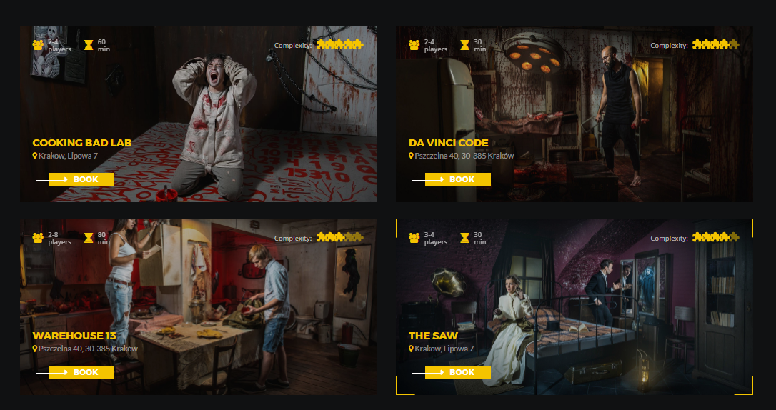
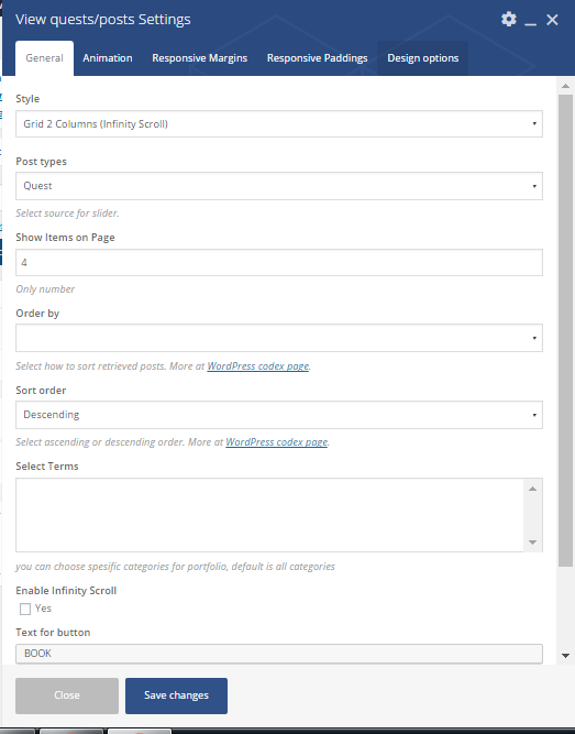
mobile desktop screen. You can select an appropriate value from thedrop-down list.- Style – select the post`s style. It can take one of the following values: Grid 2 columns (Infinity scroll), Grid 3columns (view more)
- Post type – select the post`s type. It can take one of the following values: Quest or Post
- Show items on page – place
a number of posts on page - Order – no option
- Sort order – Select how to sort retrieved posts. It can be Descending or Ascending. More at WordPress
Codex page. - Select terms – you can choose
specific categories for portfolio, default is allcategories - Enable Infinity Scroll – click yes to add the infinity scroll
- Text for button – the title for button
- Extra class name – class name for the
element . Allows to set up additional decorations for anelement in CSS stylesheets.
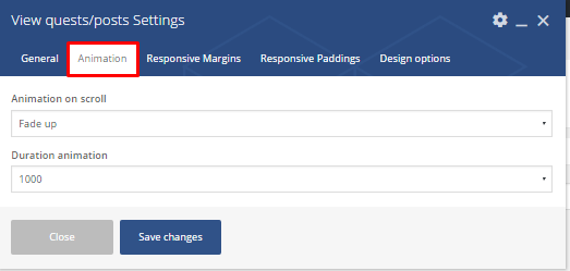
- Animation on scroll – a type of the animation on scroll
- Duration animation – continuance of the animation
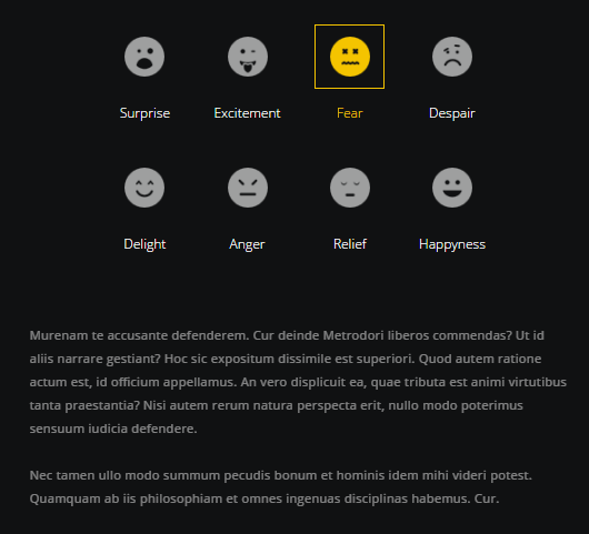
- Value options:
- Title – the title
for the value - Icon`s type – the type of icon. It can be custom or default
- Upload image for icon – if default, upload an image
- Upload image for hover – image for hover
- Description – a short description
of the value item
- Title – the title
- Extra class name – class name for the
element . Allows to set up additional decorations for theelement in CSS stylesheets.
- Animation on scroll – a type of the animation on scroll
- Duration animation – continuance of the animation
- Enable loop – enable/disable loop slider
- Autoplay – Allows
autostarting playback. The value can be in seconds.If 0 – autoplay is off. - Speed – Speed Animation. Default 1000 milliseconds
- Extra class name – class name for the
element . Allows to set up additional decorations for theelement in CSS stylesheets. - View section
- Desktop columns – set columns for desktop screen
-
Tablet columns – set columns for tablet screen
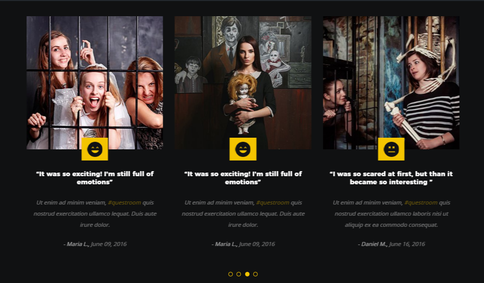
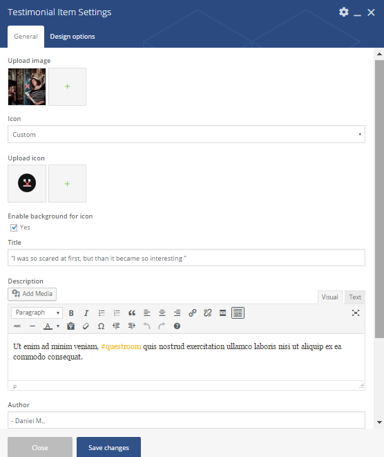
- Upload image – image for testimonial item should be uploaded
- Icon – the icon type. It can be custom or default
- Enable background for icon – adds background for icon
- Title – the testimonials title
- Description – a short description regarding the testimonials
- Author – name of person who left feedback
- Date – the date when the feedback was published
- Extra class name – class name for the
element . Allows to set up additional decorations for theelement in CSS stylesheets.