Banner Slider shortcode
This shortcode allows to create awesome banner sliders on your pages
Content Settings:
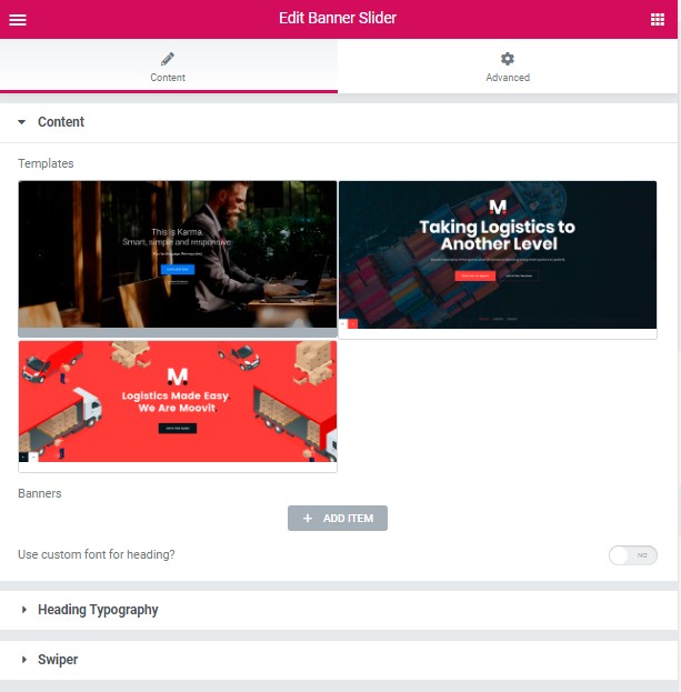
Templates – Here you can choose template style for your banner slider (Simple, Moovit Modern, Moovit Creative)
Simple Style:
Banners:
Add item – Please, add the item to create and edit the slide
Image – Here you can add the image for the banner slide
Title – Here you can add the title for current banner slide
Description – Here you can add the description for the current banner slide
Align – Here you can select the content align.
Buttons direction – Please, select horizontal or vertical buttons direction
Add button – Turn on the switcher to add the button for current banner slide
- Layout – Please, select the button layout.
- Name – Please, enter the button text.
- Link – Please, add a URL to the button.
- Style – Here you can select the button style (dark or light).
- Size – Here you can select button size (small or large).
- Type – Here you can select the button type (reverse or transparent).
- Box shadow – This option allows you to add the box-shadow to the button.
- Style – Please, select the video button style
- Size – Please, select the video button size
Heading Typography:
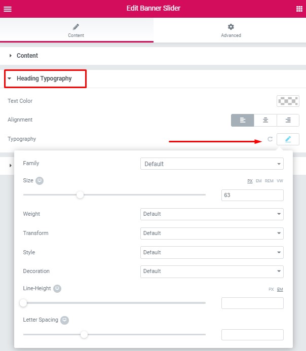
- Family – Here you can select the typography for the heading
- Size – Here you can set up the heading size
- Weight – Please, select the weight for the heading
- Transform – This option allows to change the case of the text.
- Style – Please, select text style for the heading
- Decoration – Please, select style for the heading decoration
- Line-Height – Here you can enter a line height for the heading
Swiper Settings:
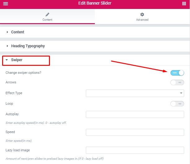
- Arrows – Turn on the switcher to display swiper in arrows style
- Effect Type – Here you can select from the list the effect type for swiper (Slide, Fade, Cube, Flip, Coverflow)
- Loop – Turn on the switcher to display the loop effect
- Autoplay – Please, enter autoplay speed(in ms). 0 – autoplay off.
- Speed – Please, enter speed(in ms).
- Lazy load image – Amount of next/prev slides to preload lazy images in. (if 0 – lazy load off)
Moovit Modern Style:
Banners:
Add item – Please, add the item to create and edit the slide.
Background Image – Here you can add the image for the background.
Additional Image – Here you can add the additional image.
Title – Here you can add the title for current banner slide.
Description – Here you can add the description for the current banner slide.
Align – Here you can select the content align.
Buttons direction – Please, select horizontal or vertical buttons direction .
Add button – Turn on the switcher to add the button for current banner slide.
- Layout – Please, select the button layout.
- Name – Please, enter the button text.
- Link – Please, add a URL to the button.
- Style – Here you can select the button style (dark or light).
- Size – Here you can select button size (small or large).
- Type – Here you can select the button type (reverse or transparent).
- Box shadow – This option allows you to add the box-shadow to the button.
- Style – Please, select the video button style.
- Size – Please, select the video button size.
Heading Typography:
- Family – Here you can select the typography for the heading.
- Size – Here you can set up the heading size.
- Weight – Please, select the weight for the heading.
- Transform – This option allows to change the case of the text.
- Style – Please, select text style for the heading.
- Decoration – Please, select style for the heading decoration.
- Line-Height – Here you can enter a line height for the heading.
Swiper Settings:
- Arrows – Turn on the switcher to display swiper in arrows style .
- Pagination – Turn on the switcher to display the sliders pagination.
- Effect Type – Here you can select from the list the effect type for swiper (Slide, Fade, Cube, Flip, Coverflow).
- Loop – Turn on the switcher to display the loop effect.
- Simulate Touch – Turn on the switcher to simulate touch effect.
- Autoplay – Please, enter autoplay speed(in ms). 0 – autoplay off.
- Speed – Please, enter speed(in ms).
- Lazy load image – Amount of next/prev slides to preload lazy images in. (if 0 – lazy load off).
Moovit Creative Style:
Banners:
Add item – Please, add the item to create and edit the slide.
Background Image – Here you can add the image for the background.
Additional Image – Here you can add the additional image.
Title – Here you can add the title for current banner slide.
Align – Here you can select the content align.
Add button – Turn on the switcher to add the button for current banner slide.
- Layout – Please, select the button layout.
- Name – Please, enter the button text.
- Link – Please, add a URL to the button.
- Style – Here you can select the button style (dark or light).
- Size – Here you can select button size (small or large).
- Type – Here you can select the button type (reverse or transparent).
- Box shadow – This option allows you to add the box-shadow to the button.
Heading Typography:
- Family – Here you can select the typography for the heading.
- Size – Here you can set up the heading size.
- Weight – Please, select the weight for the heading.
- Transform – This option allows to change the case of the text.
- Style – Please, select text style for the heading.
- Decoration – Please, select style for the heading decoration.
- Line-Height – Here you can enter a line height for the heading.
Swiper Settings:
- Arrows – Turn on the switcher to display swiper in arrows style .
- Effect Type – Here you can select from the list the effect type for swiper (Slide, Fade, Cube, Flip, Coverflow).
- Loop – Turn on the switcher to display the loop effect.
- Simulate Touch – Turn on the switcher to simulate touch effect.
- Autoplay – Please, enter autoplay speed(in ms). 0 – autoplay off.
- Speed – Please, enter speed(in ms).
- Lazy load image – Amount of next/prev slides to preload lazy images in. (if 0 – lazy load off).