Layout Settings: #
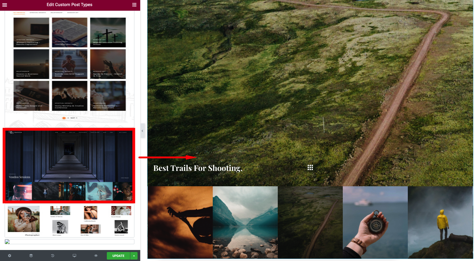
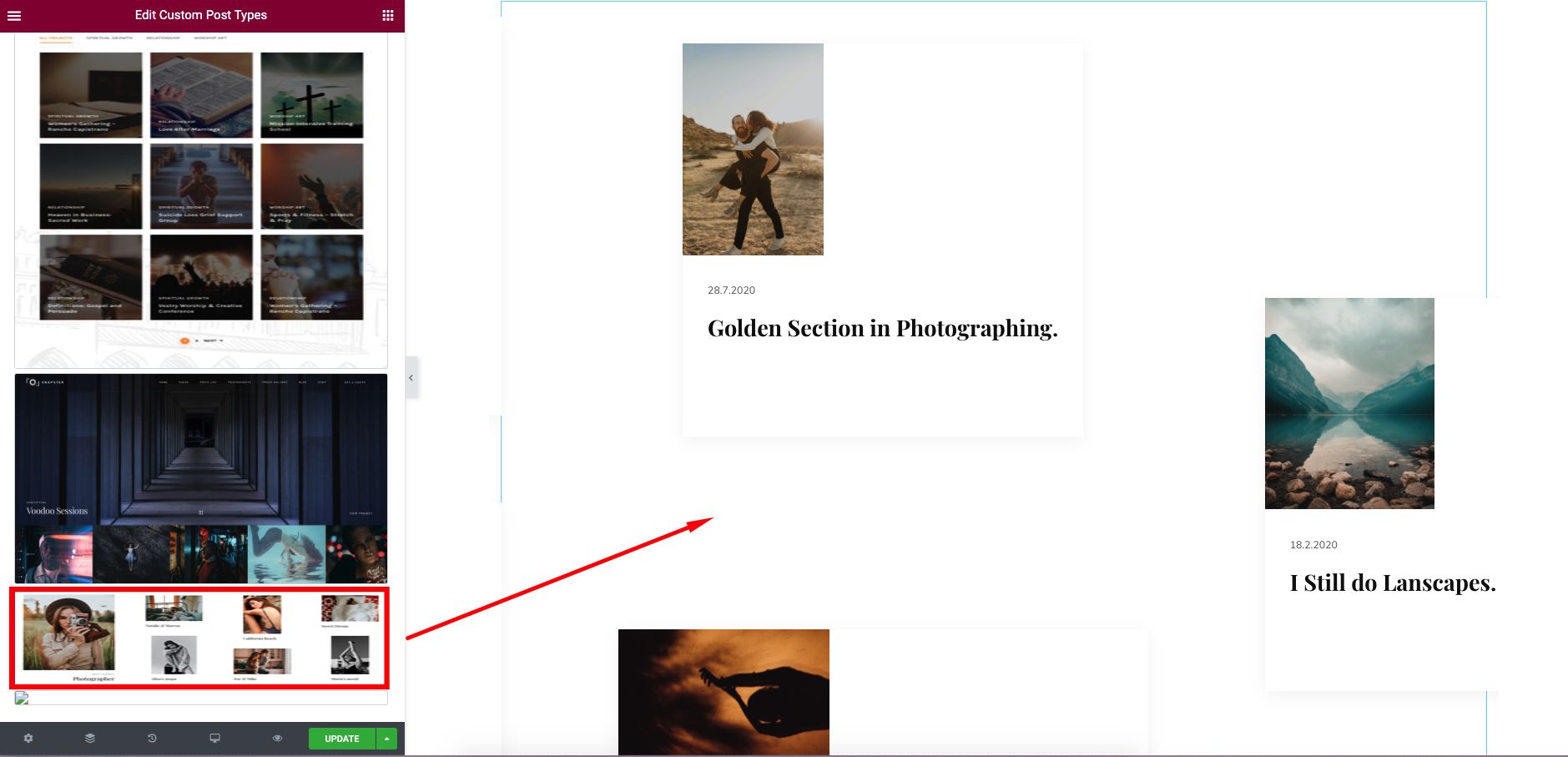
Templates – Here you can select template style for your Post Type section. This theme includes Snapster Slider Thumbnail, Snapster Modern and Snapster Horizontal Slider Templates Layout
Content Settings: #
Snapster Slider Thumbnail #
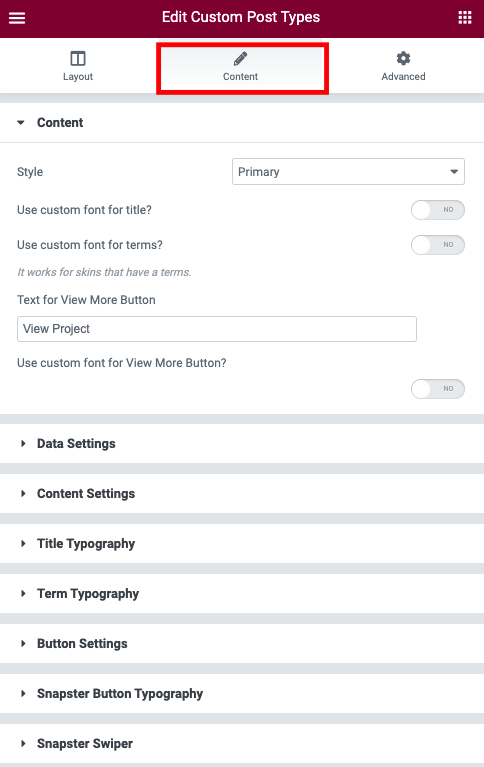
- Style – Here you can select Light or Dark Style for Post section
- Use the custom font for the title? – Turn on the switch if you want to customize the title typography.
- Use the custom font for the terms? – Turn on the switch if you want to customize the terms typography.
- Text for View More Button – Please enter text for Button
- Use custom font for View More Button – Turn on the switch if you want to customize Button typopgraphy
Snapster Modern Slider #
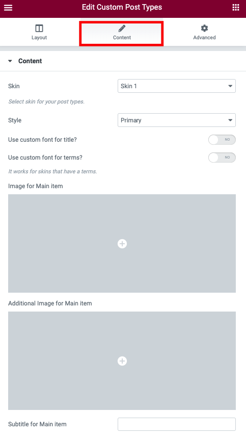
- Skin – Please, select a skin for your post types.
- Style – Here you can select Light or Dark Style for Post section
- Use the custom font for the title? – Turn on the switch if you want to customize the title typography.
- Use the custom font for the terms? – Turn on the switch if you want to customize the terms typography.
- Image for Main item – Please choose Image for main item.
- Image for Main item – Please choose Image for main item
- Additional Image for Main item – Here you can add image for additional item
- Subtitle for Main item – Here you can enter subtitle text for Main item
- Title for Main item – Please enter the text for Main item title
- Link for Main item – Here you can add URL for Main item
Snapster Horizontal Slider #
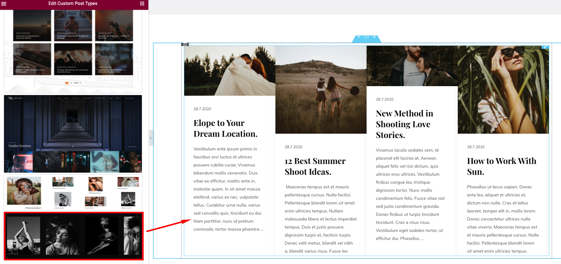
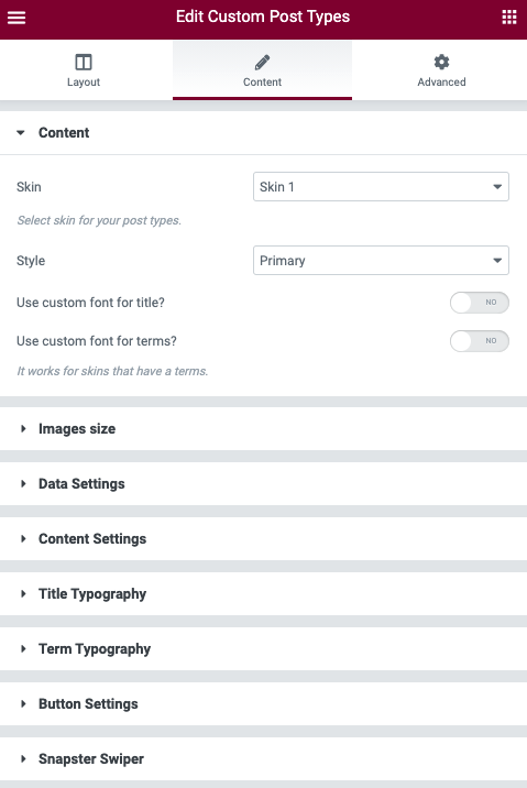
- Skin – Please, select a skin for your post types.
- Style – Here you can select Light or Dark Style for Post section
- Use the custom font for the title? – Turn on the switch if you want to customize the title typography.
- Use the custom font for the terms? – Turn on the switch if you want to customize the terms typography.
Images Size: #
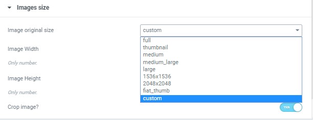
Image size – This option allos to resize image. You can choose needed size from the list or enter custom image width and height.
Data Settings: #
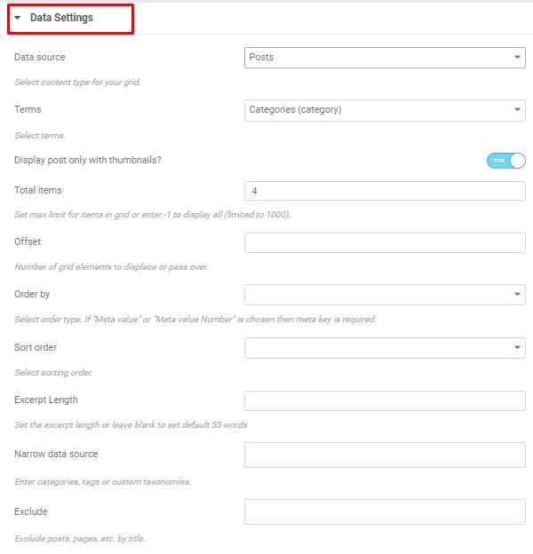
- Data source – Please, select the content type to display
- Terms – Please, select the terms to display
- Display post only with thumbnails? – Turn on the switch if you want to display the post only with thumbnails.
- Total items – Set max limit for items in a grid or enter -1 to display all (limited to 1000).
- Offset – Here you can enter the number of grid elements to displace or pass over.
- Order by – Select order type. If “Meta value” or “Meta value Number” is chosen then meta key is required.
- Sort order – Here you can select the sorting order.
- Excerpt Length – Set the excerpt length or leave blank to set default 55 words
- Narrow data source – Please, enter categories, tags or custom taxonomies.
- Exclude – Exclude posts, pages, etc. by title.
Content Settings: #

- Element tag for title – Here you can select the title tag
- Image Height – Here you can enter height relative to image width (percentage). Value between 30-100.
Title Typography #
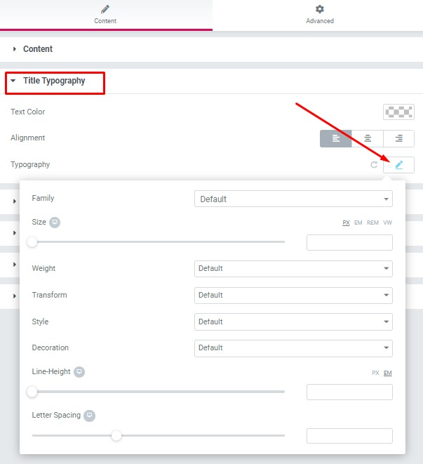
Text Color – Here you can select title color from the palette.
Alignment – Here you can select the title alignment.
Typography items:
- Family – Here you can select the typography for the title.
- Size – Here you can set up the title size.
- Weight – Please, select the weight for the title.
- Transform – This option allows to change the case of the text.
- Style – Please, select text style for the title.
- Decoration – Please, select a style for the title decoration.
- Line-Height – Here you can enter a line height for the title.
- Letter Spacing – Here you can enter a letter spacing for the title.
Term Typography #
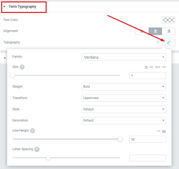
Text Color – Here you can select term color from the palette.
Alignment – Here you can select the term alignment.
Typography items:
- Family – Here you can select the typography for the term.
- Size – Here you can set up the term size.
- Weight – Please, select the weight for the terms.
- Transform – This option allows to change the case of the terms.
- Style – Please, select text style for the terms.
- Decoration – Please, select a style for the terms decoration.
- Line-Height – Here you can enter a line height for the terms.
- Letter Spacing – Here you can enter a letter spacing for the terms.
Button Settings #
Add Button – Turn on the switch if you want to add the button
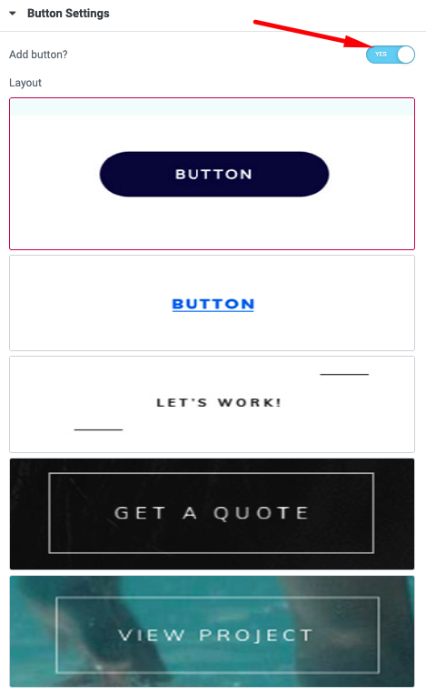
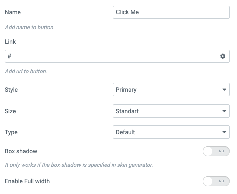
Button items:
- Layout – Please, select the button layout.
- Name – Please, enter the button text.
- Link – Please, add a URL to the button.
- Style – Here you can select the button style (dark or light).
- Size – Here you can select button size (small or large).
- Type – Here you can select the button type (reverse or transparent).
- Box shadow – This option allows you to add the box-shadow to the button.
- Enable Full Width – Turn on the switch to display full width for button
Snapster Swiper #
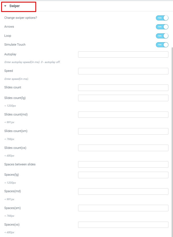
- Change swiper settings? – Turn on the switch if you want to change the slider settings.
- Arrows – Turn on the switch if you want the arrows to be displayed.
- Loop – Turn on the switch to display the loop effect.
- Simulate Touch – Turn on the switch if you want to display a simulation touch.
- AutoPlay – Here you can enter the auto play rate (in ms). 0 – automatic shutdown.
- Speed – Here you can enter the speed (in ms).
- Number of slides – here you can enter the number of slides by default.
- Number of slides (lg) – Here you can enter the number of default slides on devices width <1200px.
- Slide count (md) – Here you can enter the default slider count for devices with a width of <991px.
- Number of slides (cm) – Here you can enter the default number of slides on devices with a width of <768px.
- Number of slides (xs) – Here you can enter the default number of slides on devices with a width of <480px.
- Slide spaces – Here you can enter the spaces between the default slides.
- Spaces (lg) – Here you can enter spaces between slides on devices with a width of <1200px.
- Spaces (md) – Here you can enter spaces between slides on devices with a width of <991px.
- Spaces (cm) – Here you can enter spaces between slides on devices with a width of <768px.
- Spaces (xs) – Here you can enter slides between devices on widths <480px.


