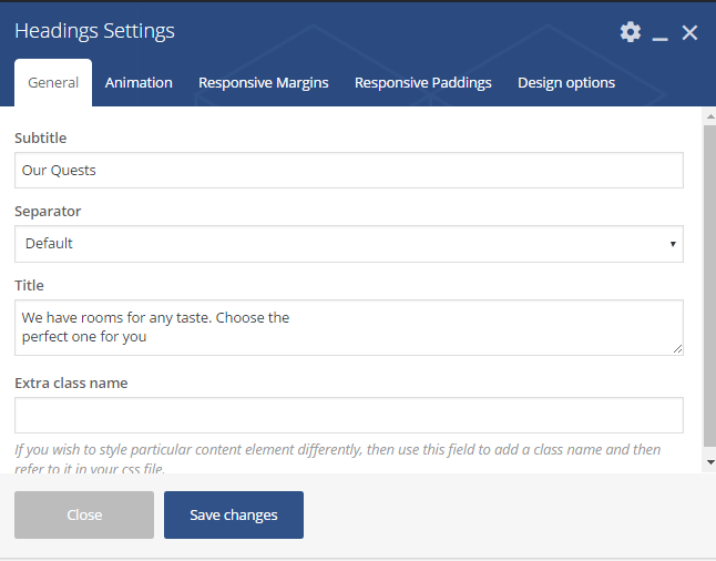
- Subtitle – the heading`s subtitle
- Separator – a dividing line. It can be one of the following values: default, custom, none. If none – separator will be disabled
- Title – the Headings title. Displayed under the separator
- Extra class name – class name for element. Allows to set up additional decorations for element in CSS stylesheets.
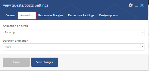
- Animation on scroll – a type of the animation on scroll
- Duration animation – continuance of the animation
- Responsive margins
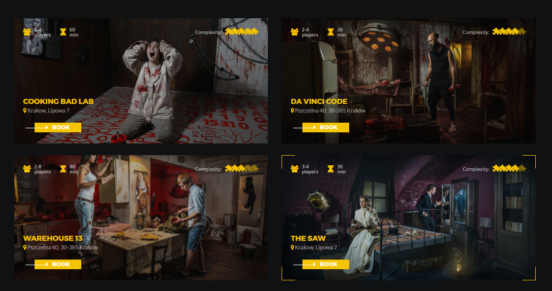
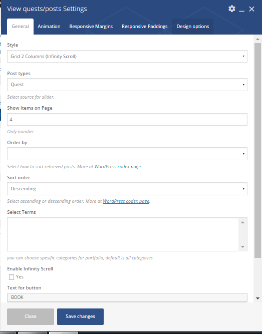
- Style – select the post`s style. It can take one of the following values: Grid 2 columns (Infinity scroll), Grid 3columns (view more)
- Post type – select the post`s type. It can take one of the following values: Quest or Post
- Show items on page – place an amount of posts on page
- Order – no option
- Sort order – Select how to sort retrieved posts. It can be Descending or Ascending. More at WordPress codex page.
- Select terms – you can choose spesific categories for portfolio, default is all categorie
- Enable Infinity Scroll – click yes to add the infinity scroll
- Text for button – the title for button
- Extra class name – class name for element. Allows to set up additional decorations for element in CSS stylesheets.
- Animation on scroll – a type of the animation on scroll
- Duration animation – continuance of the animation
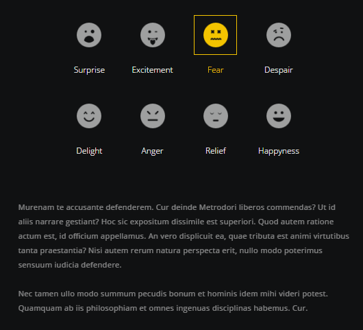
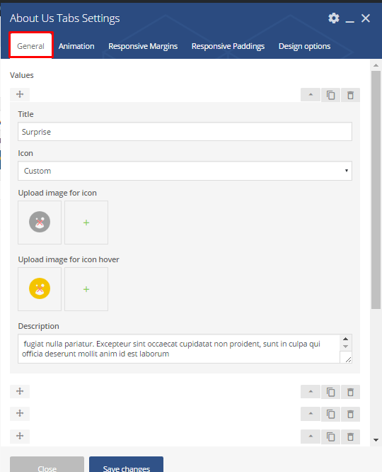
- Value options:
- Title – the title for the value
- Icon`s type – the type of icon. It can be custom or default
- Upload image for icon – if default, upload an image
- Upload image for hover – image for hover
- Description – a short description for the value item
- Extra class name – class name for element. Allows to set up additional decorations for element in CSS stylesheets.
- Animation on scroll – a type of the animation on scroll
- Duration animation – continuance of the animation
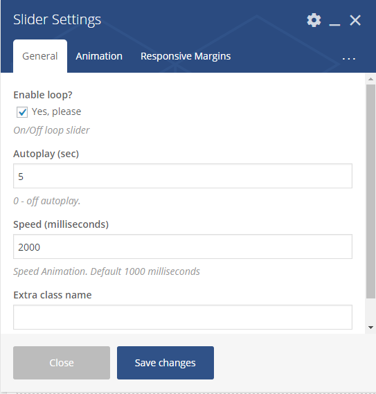
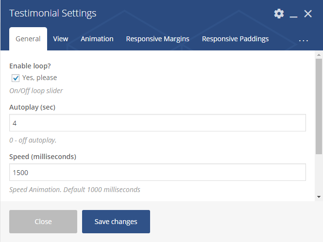
- Enable loop – enable/disable loop slider
- Autoplay – Allows autostart playback. The value can be in seconds.If 0 – autoplay is off.
- Speed – Speed Animation. Default 1000 milliseconds
- Extra class name – class name for element. Allows to set up additional decorations for element in CSS stylesheets.
- View section
- Desktop columns – set columns for desktop screen
-
Tablet columns – set columns for tablet screen
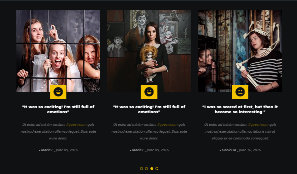
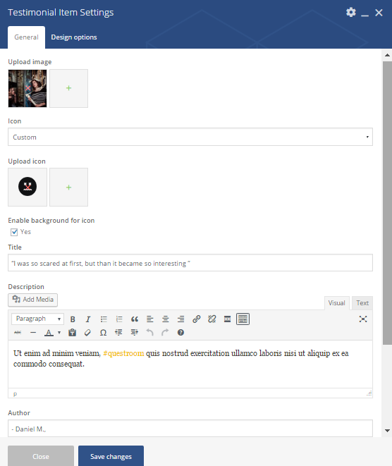
- Upload image – image for testimonial item should be uploaded
- Icon – the icon type. It can be custom or default
- Enable background for icon – adds background for icon
- Title – the testimonials title
- Description – a short description regarding the testimonials
- Author – name of person who left feedback
- Date – the date when the feedback was published
- Extra class name – class name for element. Allows to set up additional decorations for element in CSS stylesheets.
Slider

The shortcode is a parent one, which means you would need to add a parent and than child shortcode:
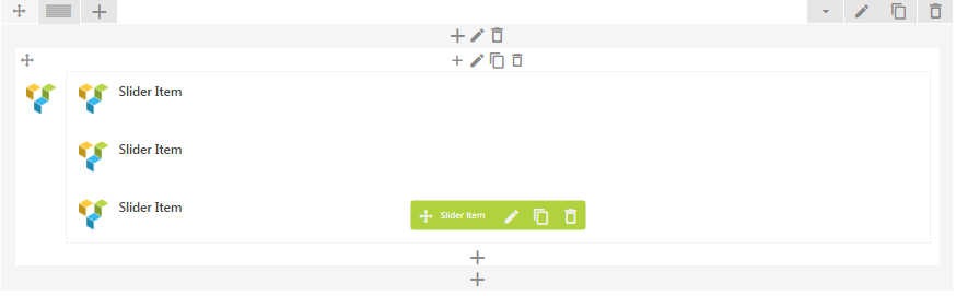
Parent shortocode:
Enable loop – enable/disable loop slider
Autoplay – Allows autostart playback. The value can be in seconds.If 0 – autoplay is off.
Speed – speed animation. Default 1000 milliseconds
Extra class name – class name for element. Allows to set up additional decorations for element in CSS stylesheets.
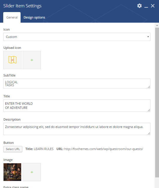
Child shortcode parameters:
Icon – the icon type. It can be one of the following types: custom or default
Upload icon – if custom type selected in the field abowe, upload an icon form library
Subtitle – the subtitle for slider
Title – the title for slider
Description – a short description of the slider. Displayed under the title.
Button – title and the URL where the link from the button leads to.
Image – class name for element. Allows to set up additional decorations for element in CSS stylesheets.
Extra class name – class name for element. Allows to set up additional decorations for element in CSS stylesheets.
Animation on scroll – a type of the animation on scroll
Duration animation – continuance of the animation
In Animation section
Headings shortcode
 Parameters:
In Animation section
Large desktop margin top/bottom – set margins for large desktop screen. You can select an appropriate value from drop-down list.
Medium desktop margin top/bottom – set margins for medium (laptop) desktop screen. You can select an appropriate value from drop-down list.
Mobile margin top/bottom – set margins for mobile desktop screen. You can select an appropriate value from drop-down list. Responsive padding
Desktop padding top/bottom – set padding for large desktop screen. You can select an appropriate value from drop-down list.
Medium desktop padding top/bottom – set padding for medium (laptop) desktop screen. You can select an appropriate value from drop-down list.
Mobile padding top/bottom – set padding for mobile desktop screen. You can select an appropriate value from drop-down list.
View guests/posts
Parameters:
In Animation section
About Us Tabs shortcode
Parameters:
In Animation section
Testimonials
Parent shortcode:
 Child shortcode parameters:
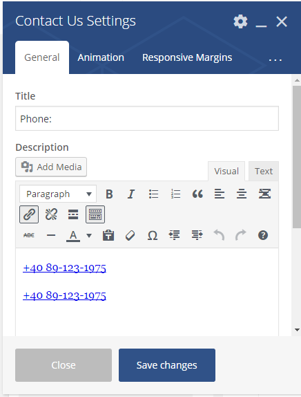
Contact us shortcode
 Parameters:
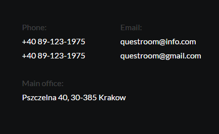
Title – the Contact`s title
Description – a short description regarding contact details
In Animation section
Animation on scroll – a type of the animation on scroll
Duration animation – continuance of the animation
Responsive margins
Large desktop margin top/bottom – set margins for large desktop screen. You can select an appropriate value from drop-down list.
Medium desktop margin top/bottom – set margins for medium (laptop) desktop screen. You can select an appropriate value from drop-down list.
Mobile margin top/bottom – set margins for mobile desktop screen. You can select an appropriate value from drop-down list.
Responsive padding
Desktop padding top/bottom – set padding for large desktop screen. You can select an appropriate value from drop-down list.
Medium desktop padding top/bottom – set padding for medium (laptop) desktop screen. You can select an appropriate value from drop-down list.
Mobile padding top/bottom – set padding for mobile desktop screen. You can select an appropriate value from drop-down list.