The Design Options in the Aheto Plugin provide extensive customization across various aspects of your theme, enabling you to personalize the appearance of elements like skins, colors, typography, buttons, and forms. Below is a detailed guide on each tab in the Design Options section.
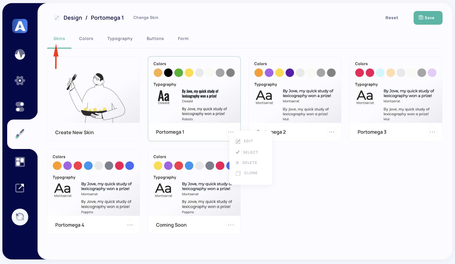
1. Skin #
The Skin tab allows you to create and manage skins for your theme, each with unique color and typography settings. This feature is beneficial for maintaining consistent styling across the website while allowing variations in appearance as needed.
Skin Settings #
- Create New Skin: This option allows you to create a new custom skin with specific color and typography settings tailored to your design preferences.
- Existing Skins: The theme includes several pre-made skins (e.g., Portomega 1 to Portomega 4) that showcase various color schemes and typography choices. You can:
- Edit: Customize an existing skin to adjust its color and typography.
- Select: Apply a chosen skin across your site.
- Delete: Remove a skin you no longer need.
- Clone: Duplicate an existing skin to create a similar version with slight modifications.
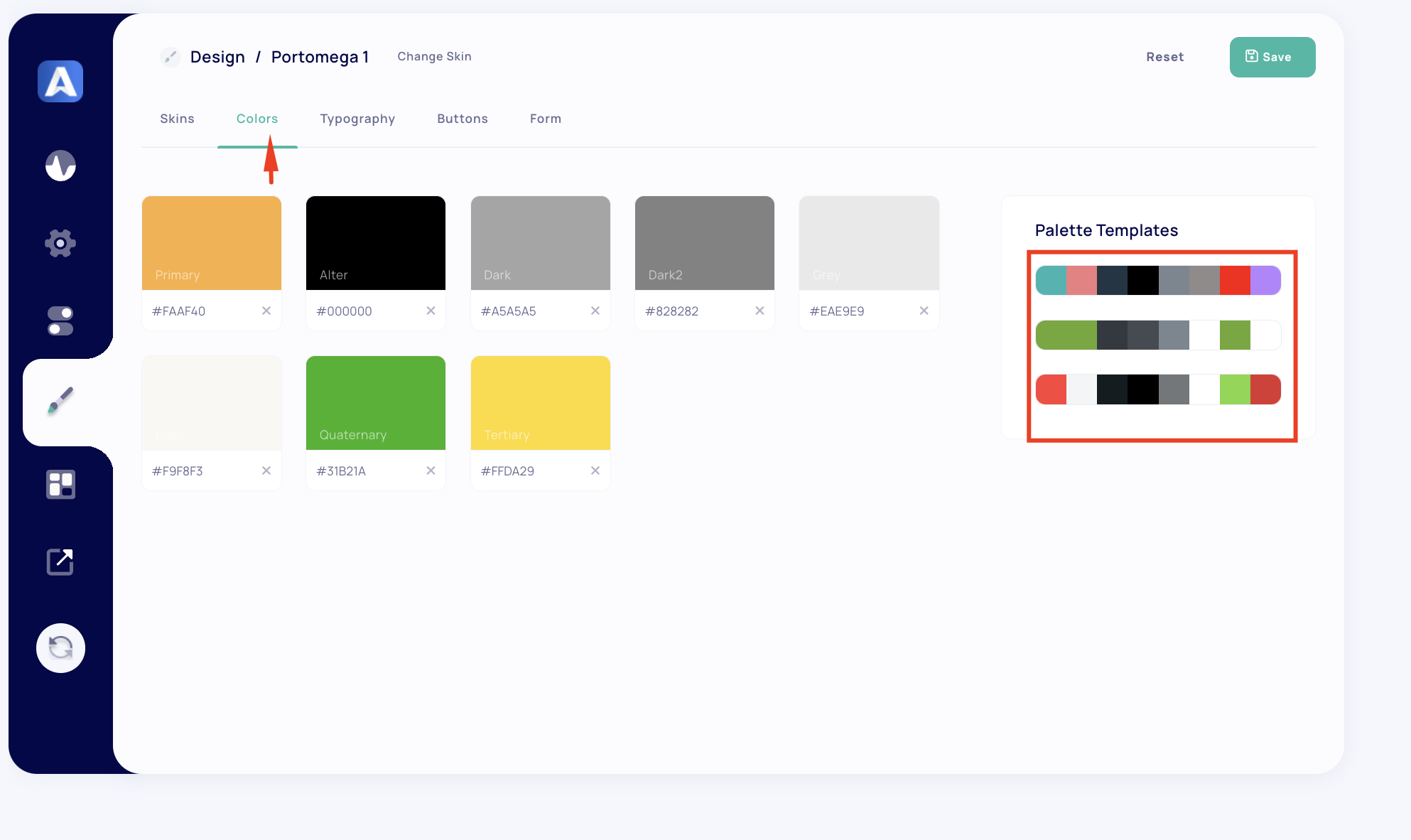
2. Colors #
The Colors tab allows you to define individual color values for various elements within your theme, providing control over your theme’s color scheme. You can set primary and accent colors, as well as shades for different contexts, ensuring a cohesive look across your site.
Color Settings #
- Primary Color: The main color used throughout the theme.
- Alter: Secondary color, often used for contrasts.
- Dark: Darker shade used for text or backgrounds.
- Dark2: Another dark shade for depth variation.
- Grey: Light grey tone for neutral areas.
- Light: Background or accent light shade.
- Quaternary: Additional color option for accents.
- Tertiary: Third accent color.
- Palette Templates: Choose colors from preset templates to quickly apply a cohesive palette to your theme.
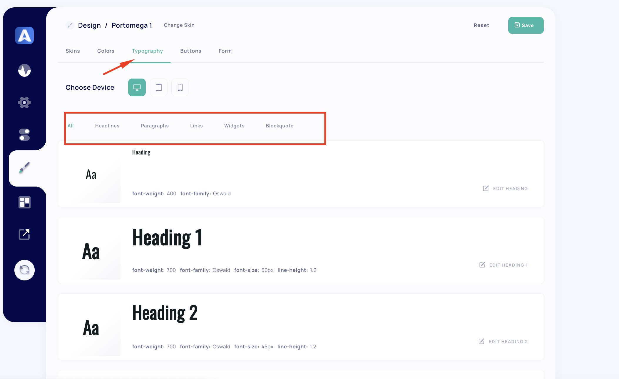
3. Typography #
The Typography tab provides complete control over font styles across different devices, allowing customization for desktop, tablet, and mobile screens. You can configure typography settings for headings, paragraphs, links, widgets, and blockquotes within the theme.
Typography Settings #
- Choose Device: Select between desktop, tablet, and mobile views to ensure typography is responsive and consistent.
- Global Typography Options:
- All Sections: Apply typography settings across all sections of the site, including headings, paragraphs, links, widgets, and blockquotes.
- Individual Sections: Customize typography within each section separately if needed.
- Font Attributes:
- Headings: Set font weight, size, line height, and family for various heading levels (H1 through H6).
- Paragraphs: Customize font weight, size, and line height.
- Links: Define link styling for text links.
- Widgets: Adjust typography for widget titles.
- Blockquotes: Configure font style for quotes and author text.
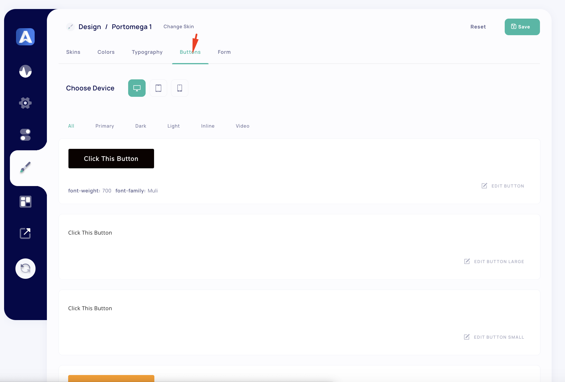
4. Buttons #
The Buttons tab provides design settings for button styles across the theme, with options to adjust styles based on the device type—desktop, tablet, or mobile. You can modify the appearance of different button types such as primary, dark, light, inline, and video buttons.
Button Settings #
- Choose Device: Select the target device to customize button styles specifically for desktop, tablet, or mobile layouts.
- Button Types:
- Primary Button: Define the main button style used across the theme.
- Dark Button: Style settings for buttons with a dark theme.
- Light Button: Settings for light-themed buttons.
- Inline Button: Customization for inline-styled buttons.
- Video Button: Design options for buttons that trigger video playback.
- Button Variants:
- Customize each button’s size (small, large) and style attributes such as font weight, color, and font family to ensure they align with your site’s visual identity.
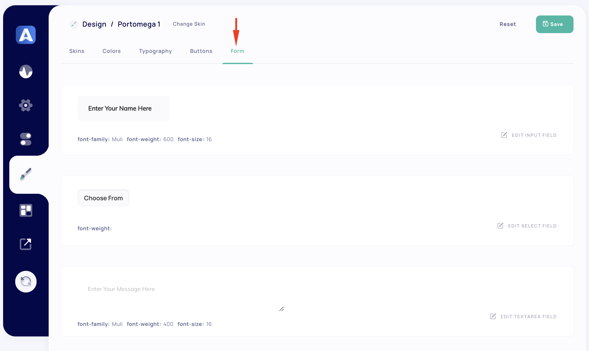
5. Form #
The Form tab allows you to design the appearance of form elements in your theme, ensuring they match the site’s overall style.
Form Settings #
- Input Fields: Customize input field styles, including font, weight, and size.
- Example: Enter Your Name Here — define font, weight, and other style settings.
- Select Fields: Design dropdown fields used in forms.
- Textarea Fields: Configure appearance for text areas, allowing multi-line text input.
Summary #
The Design Options in the Aheto Plugin provide a comprehensive toolkit for tailoring the visual components of your theme. By using these tabs effectively, you can establish a unique look for your website that aligns with your brand identity and enhances user experience.


