Call To Action shortcode: #

Content Setting: #
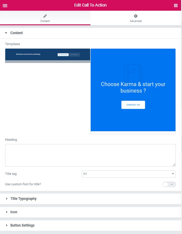
Templates – Please, select the template for the Call To Action section
Modern Style: #
Heading – Here you can add the heading text for the Call To Action section.
Title tag – Please, select the title tag for the Call To Action section.
Use the custom font for the title – Turn on switcher if you want to customize the font title for the Call To Action section.
Title Typography: #

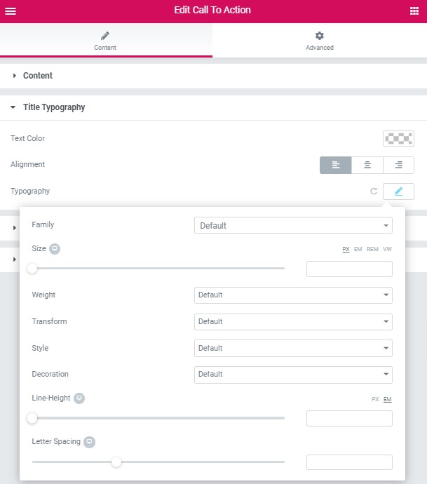
Text Color – Here you can select title color from the palette.
Alignment – Here you can select the title alignment.
Typography item:
- Family – Here you can select the typography for the title.
- Size – Here you can set up the title size.
- Weight – Please, select the weight for the title.
- Transform – This option allows to change the case of the text.
- Style – Please, select text style for the title.
- Decoration – Please, select a style for the title decoration.
- Line-Height – Here you can enter a line height for the title.
Icon: #

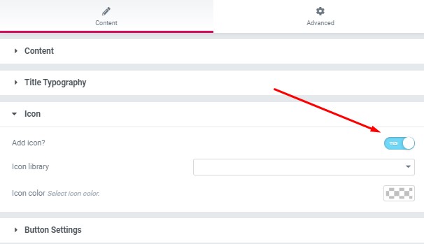
- Add icon? – Please, turn on the switcher to add the icon.
- Icon library – Please, select the icon library from the list.
- Icon – Here you can choose the icon.
- Icon color- Here you can select the icon color from the palette
Button Settings: #

Button items:
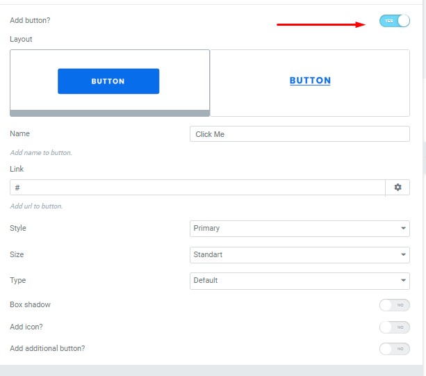
- Layout – Please, select the button layout.
- Name – Please, enter the button text.
- Link – Please, add a URL to the button.
- Style – Here you can select the button style (dark or light).
- Size – Here you can select button size (small or large).
- Type – Here you can select the button type (reverse or transparent).
- Box shadow – This option allows you to add the box-shadow to the button.
- Add icon? – Please, turn on the switcher to add the icon.
- Icon library – Please, select the icon library from the list.
- Icon – Here you can choose the icon.
- Icon position – Here you can select the icon position (right or left).
- Align – Here you can select the icon align.
Add an additional button? – This option allows you to add the additional button to the banner slider.
Button items:
- Layout – Please, select the button layout.
- Name – Please, enter the button text.
- Link – Please, add a URL to the button.
- Style – Here you can select the button style (dark or light).
- Size – Here you can select button size (small or large).
- Type – Here you can select the button type (reverse or transparent).
- Box shadow – This option allows you to add the box-shadow to the button.
Classic Style: #
Heading – Here you can add the heading text for the Call To Action section.
Title tag – Please, select the title tag for the Call To Action section.
Use the custom font for the title – Turn on switcher if you want to customize font title for the Call To Action section.
Title Typography: #
Text Color – Here you can select title color from the palette.
Alignment – Here you can select the title alignment.
Typography item:
- Family – Here you can select the typography for the title.
- Size – Here you can set up the title size.
- Weight – Please, select the weight for the title.
- Transform – This option allows to change the case of the text.
- Style – Please, select text style for the title.
- Decoration – Please, select a style for the title decoration.
- Line-Height – Here you can enter a line height for the title.
Icon: #
- Add icon? – Please, turn on the switcher to add the icon.
- Icon library – Please, select the icon library from the list.
- Icon – Here you can choose the icon.
- Icon color- Here you can select the icon color from the palette
Button Settings: #
Button items:
- Layout – Please, select the button layout.
- Name – Please, enter the button text.
- Link – Please, add a URL to the button.
- Style – Here you can select the button style (dark or light).
- Size – Here you can select button size (small or large).
- Type – Here you can select the button type (reverse or transparent).
- Box shadow – This option allows you to add the box-shadow to the button.
- Add icon? – Please, turn on the switcher to add the icon.
- Icon library – Please, select the icon library from the list.
- Icon – Here you can choose the icon.
- Icon position – Here you can select the icon position (right or left).
- Align – Here you can select the icon align.
Add an additional button? – This option allows you to add the additional button to the banner slider.
Button items:
- Layout – Please, select the button layout.
- Name – Please, enter the button text.
- Link – Please, add a URL to the button.
- Style – Here you can select the button style (dark or light).
- Size – Here you can select button size (small or large).
- Type – Here you can select the button type (reverse or transparent).
- Box shadow – This option allows you to add the box-shadow to the button.


