Contacts shortcode: #
Content Settings: #
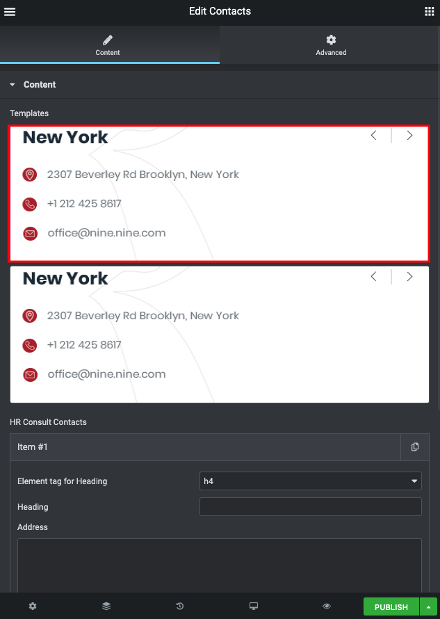
Templates – Here you can choose template style for your Contacts section (Classic and Classic 2)
Classic Style: #
Add item – Click on the button if you want to add new item to this section
- Element tag for Heading – Please, select heading tag
- Heading – Here you can add your heading text.
- Address – Here you can add the address to your contacts section.
- Phone – Please, add a phone number to the contacts section.
- Email – Please, add an email to the contacts section.
Classic Style 2: #
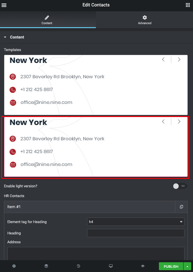
Enable light version – Turn on the switch to display the light version
Add item – Click on the button if you want to add new item to this section
- Element tag for Heading – Please, select heading tag
- Heading – Here you can add your heading text.
- Address – Here you can add the address to your contacts section.
- Phone – Please, add a phone number to the contacts section.
- Email – Please, add an email to the contacts section.
- Family – Here you can select the typography for the heading
- Size – Here you can set up the heading size
- Weight – Please, select the weight for the heading
- Transform – This option allows to change the case of the text.
- Style – Please, select text style for the heading
- Decoration – Please, select style for the heading decoration
- Line-Height – Here you can enter a line height for the heading
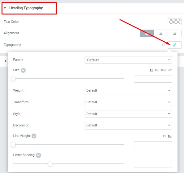
Heading Typography: #
These options is only available if you select the “Use custom font for heading” checkbox in the content settings.
Text Color – Here you can select heading color from the palette
Alignment – – Here you can select the heading alignment.
Typography item:
Button Settings: #
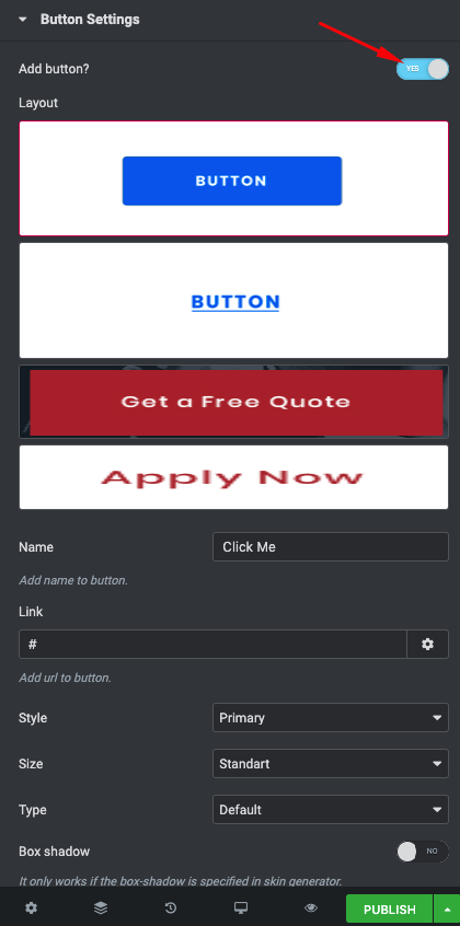
Add button – Turn on the switch to add the button
- Layout – Please, select the button layout.
- Name – Please, enter the button text.
- Link – Please, add a URL to the button.
- Style – Here you can select the button style (dark or light).
- Size – Here you can select button size (small or large).
- Type – Here you can select the button type (reverse or transparent).
- Box shadow – This option allows you to add the box-shadow to the button.
-
Box shadow – Here you can add the box shadow. It only works if the box-shadow is specified in skin generator.
-
Enable Full width – Turn on the switch to display full width.
Swiper Settings: #
Change swiper options? – Turn on switcher if you want to change the following swiper options:
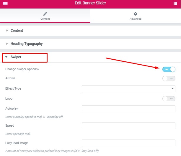
- Arrows – Turn on the switcher to display swiper in arrows style
- Effect Type – Here you can select from the list the effect type for swiper (Slide, Fade, Cube, Flip, Coverflow)
- Loop – Turn on the switcher to display the loop effect
- Autoplay – Please, enter autoplay speed(in ms). 0 – autoplay off.
- Speed – Please, enter speed(in ms).


