
Buttons Settings: #
In this section of the dashboard, you can create and customize your own button styles without special coding skills. To do this, enter the values you want in the items below.
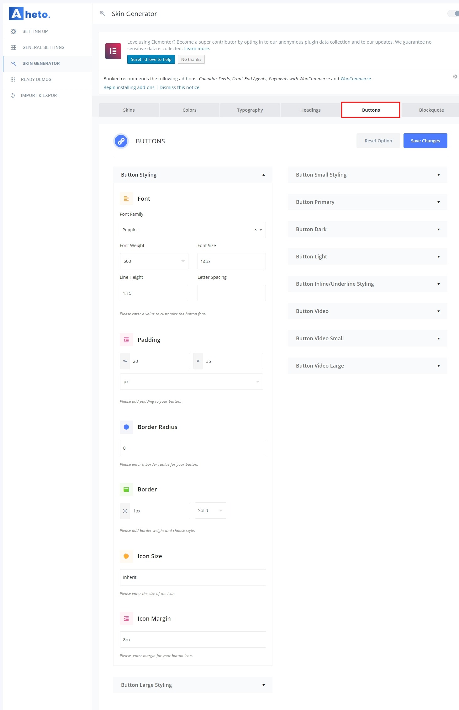
Button Styling – Please, enter values to customize the button (general options for all buttons).
- Font Family – Please, select Font Family for the buttons.
- Font Weight – Here you can select the Font weight for the buttons.
- Font Size – Here you can enter the letter spacing value for the buttons.
- Line Height – Here you can enter a line height for the buttons.
- Letter Spacing – Here you can enter a letter spacing for the buttons.
- Padding – Please add padding to your button
- Border Radius – Please enter a border-radius for your button.
- Border – Please add border weight and choose the style.
- Icon Size – Please enter the size of the icon.
- Icon Margin – Please, enter the margin for your button icon.
Button Large Styling – Please, enter values to customize the Large button.
- Font Size – Please enter a font size for the Large button.
- Letter Spacing – Please enter a letter spacing for the Large button.
- Padding – Please, enter your custom paddings for the Large Button.
Button Small Styling – Please, enter values to customize the Small button.
- Font Size – Please enter a font size for the Small button.
- Letter Spacing – Please enter a letter spacing for the Small button.
- Padding – Please, enter your custom paddings for the Small Button.
Button Primary – Please, enter values to customize the Primary button.
- Background – Please, select the background color for the Primary button.
- Font Color – Please, select a font color for the Primary button.
- Border color – Please, select border color for the Primary button.
- Background (hover) – Please, select the background color for the Primary button hover effect.
- Font Color (hover) – Please, select a font color for the Primary button hover effect.
- Border color (hover) – Please, select border color for the Primary button hover effect.
- Box Shadow – Please, enter values to customize box shadow for the Primary button.


