
Features Slider shortcode: #
Content Settings: #
Templates – Here you can choose Features Slider template (Simple Slider or Acacio Features Slider)
Simple Slider #
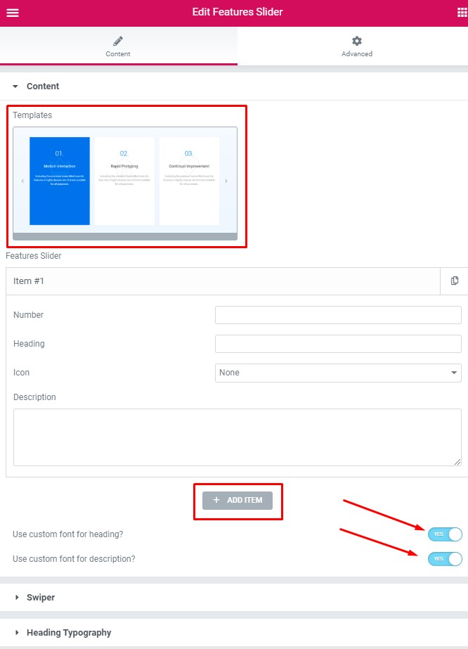
Features Slider
Add item – This option allows to add the new slider item.
Item Settings:
- Number – Here you can enter the number for this item.
- Heading – Please, enter the text for the heading.
- Icon – Here you can select the icon from the list.
- Description – Here you can add the description text.
Use custom font for heading? – Please, turn on the switch if you want to customize the heading typography.
Use custom font for description? – Please, turn on the switch if you want to customize the description typography.
Acacio Features Slider #
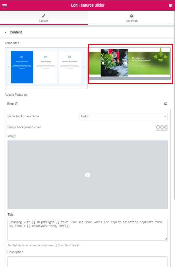
Features Slider
- Add item – This option allows to add the new slider item.
Item Settings:
- Slider background type – Here you can choose the background type (image or text)
- Shape background color – Please, select the color from the palette
- Image – Here you can add the image
- Title – Please, enter the text for title. Heading with [[ hightlight ]] text. For set some words for repeat animation separate them by coma : [[London,New York,Paris]]
- To Hightlight text insert text between: [[ Your Text Here ]]
- Description – Here you can add the text for the description
- Align – Please, select the text align
- Add button – Turn on the switch if you want to add the button to this item.
Button items:
- Layout – Please, select the button layout.
- Name – Please, enter the button text.
- Link – Please, add a URL to the button.
- Style – Here you can select the button style (dark or light).
- Size – Here you can select button size (small or large).
- Type – Here you can select the button type (reverse or transparent).
- Box shadow – This option allows you to add the box-shadow to the button.
Swiper: #
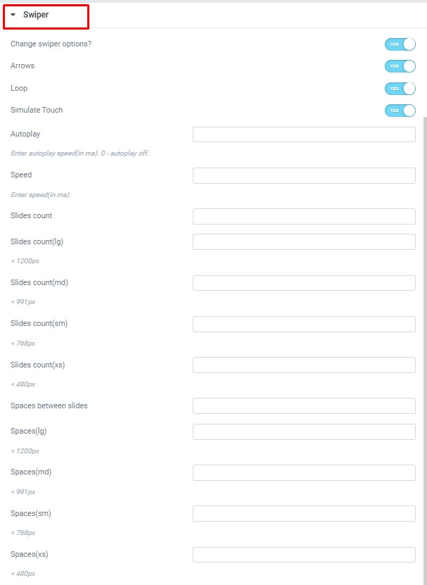
- Change swiper settings? – Turn on the switch if you want to change the slider settings.
- Arrows – Turn on the switch if you want the arrows to be displayed.
- Loop – Turn on the switch to display the loop effect.
- Simulate Touch – Turn on the switch if you want to display a simulation touch.
- AutoPlay – Here you can enter the auto play rate (in ms). 0 – automatic shutdown.
- Speed – Here you can enter the speed (in ms).
- Number of slides – here you can enter the number of slides by default.
- Number of slides (lg) – Here you can enter the number of default slides on devices width <1200px.
- Slide count (md) – Here you can enter the default slider count for devices with a width of <991px.
- Number of slides (cm) – Here you can enter the default number of slides on devices with a width of <768px.
- Number of slides (xs) – Here you can enter the default number of slides on devices with a width of <480px.
- Slide spaces – Here you can enter the spaces between the default slides.
- Spaces (lg) – Here you can enter spaces between slides on devices with a width of <1200px.
- Spaces (md) – Here you can enter spaces between slides on devices with a width of <991px.
- Spaces (cm) – Here you can enter spaces between slides on devices with a width of <768px.
- Spaces (xs) – Here you can enter slides between devices on widths <480px.
Heading Typography:
- Family – Here you can select the typography for the heading
- Size – Here you can set up the heading size
- Weight – Please, select the weight for the heading
- Transform – This option allows to change the case of the text.
- Style – Please, select text style for the heading
- Decoration – Please, select style for the heading decoration
- Line-Height – Here you can enter a line height for the heading
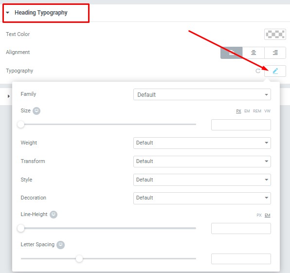
These options is only available if you select the “Use custom font for heading” checkbox in the content settings.
Text Color – Here you can select heading color from the palette
Alignment – – Here you can select the heading alignment.
Typography item:
Description Typography: #
These options is only available if you select the “Use custom font for description” checkbox in the content settings.
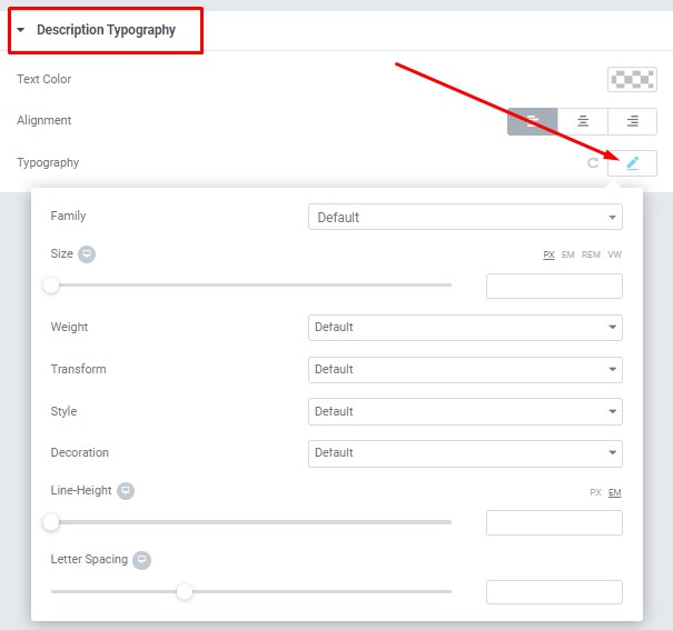
- Text Color – Here you can select title color from the palette.
- Alignment – Here you can select the title alignment.
Typography item:
- Family – Here you can select the typography for the description text.
- Size – Here you can set up the description text size.
- Weight – Please, select the weight for the description text.
- Transform – This option allows to change the case of the description text.
- Style – Please, select text style for the description text.
- Decoration – Please, select a style for the description text decoration.
- Line-Height – Here you can enter a line height for the description text.


