Contents Shortcode: #
This shortcode allows adding a section with different contents to the page.
Content Settings: #
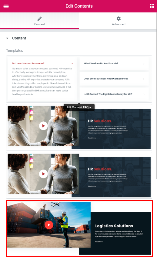
Templates – Here you can choose template style for your contents shortcode (HR Consult FAQ’s, HR Consult Creative slider, HR Modern, HR Simple Text with icon).
HR Consult FAQ’s Style: #
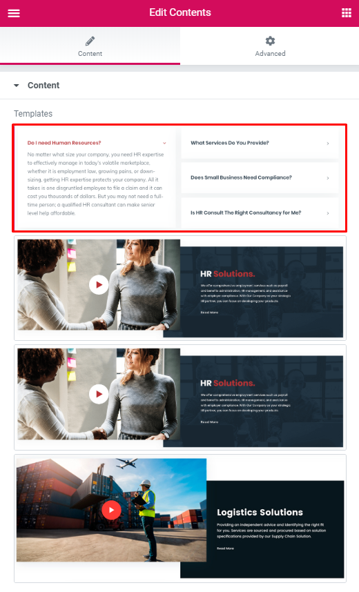
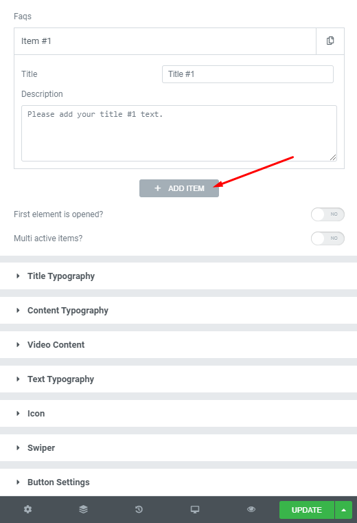
Faqs:
Add item – Please, click on the button to add new Faq item.
Item settings:
- Title – Here you can add the title for current Faq item;
- Description – Here you can add the description for the current Faq item.
First element is opened? – Turn on switcher if you want to display the first item opened.
Multi active items? – Turn on the switcher if you want to display multi-active items.
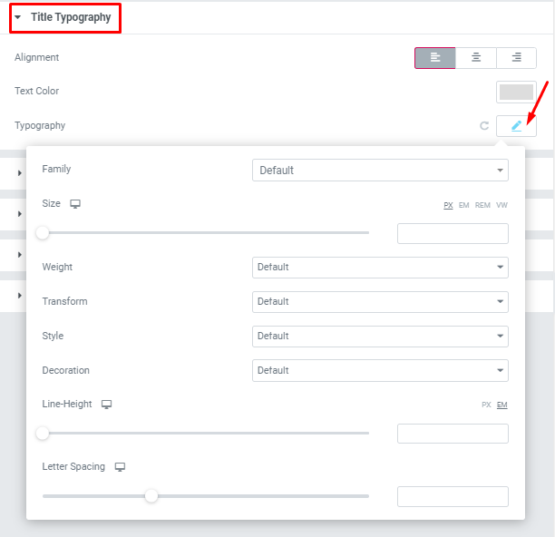
Title Typography: #
#
If you turn on the switcher “Use custom font for title?” in Content Settings you can customize font for the title.
- Family – Here you can select the typography for the title;
- Size – Here you can set up the title size;
- Weight – Please, select the weight for the title;
- Transform – This option allows to change the case of the text;
- Style – Please, select text style for the title;
- Decoration – Please, select style for the title decoration;
- Line-Height – Here you can enter a line height for the title;
Content Typography: #
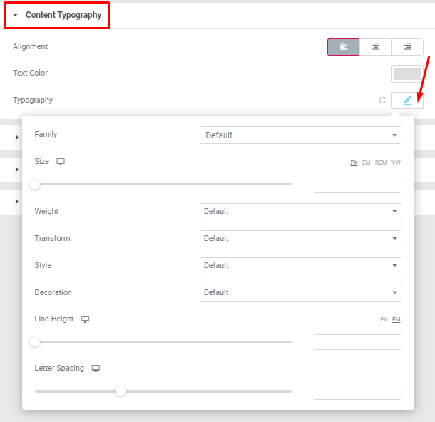
If you turn on the switcher “Use custom font for content?” in Content Settings you can customize font for the content.
Alignment – – Here you can select the content alignment.
Text Color – Here you can select content color from the palette.
- Family – Here you can select the typography for the content;
- Size – Here you can set up the content size;
- Weight – Please, select the weight for the content;
- Transform – This option allows to change the case of the text;
- Style – Please, select text style for the content;
- Decoration – Please, select style for the content decoration;
- Line-Height – Here you can enter a line height for the content;
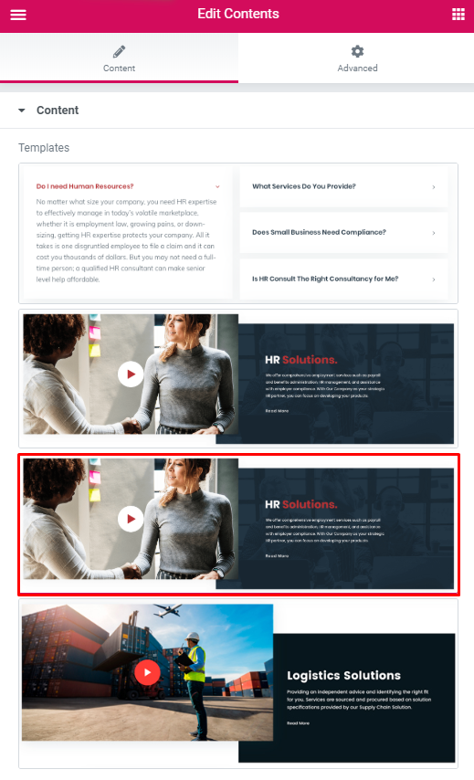
HR Consult Creative slider Style: #
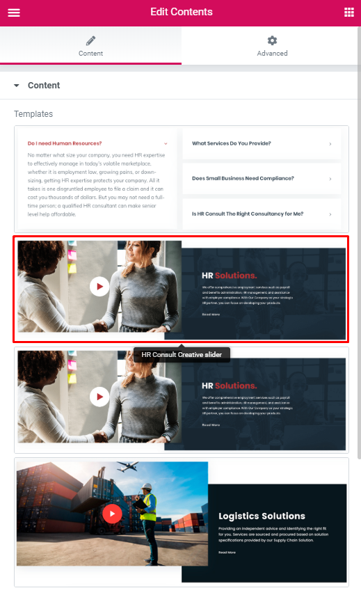
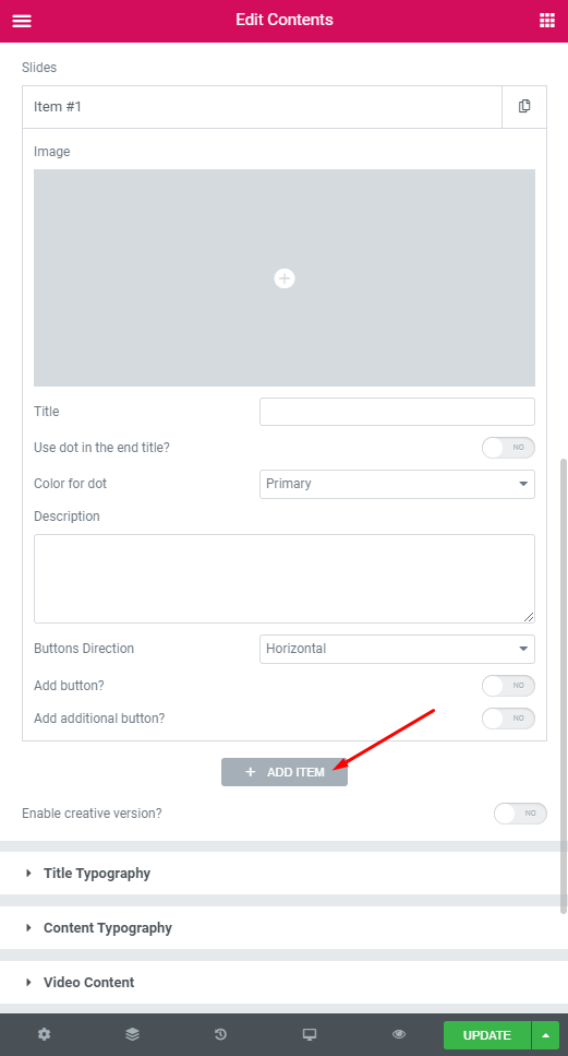
Slides:
Add Item – Please, click on the button to add a new item.
Item settings:
Image – Here you can choose the image for the item;
Title – Here you can add the title for the current item;
Use dot in the end title? – Turn on the switcher if you want to use dot at the end of the title;
Color for dot – Select the color for the dot (Dark or Light);
Description – Here you can add the description for the current item;
Buttons Direction – Choose the direction of the buttons (Horizontal or Vertical).
Add button? – Turn on the switcher to add the button for current banner slide. If you turn on the switcher, there are the next items:
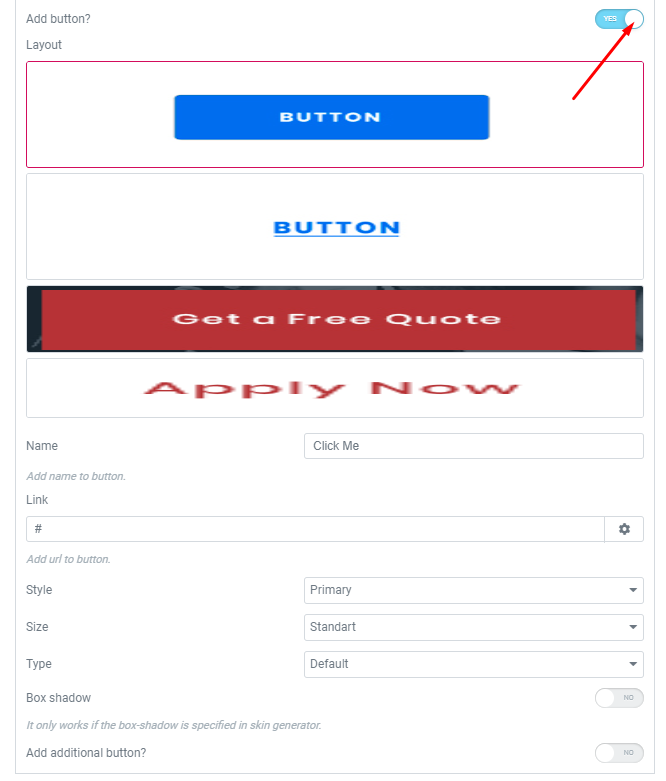
- Layout – Please, select the button layout.
- Name – Please, enter the button text.
- Link – Please, add a URL to the button.
- Style – Here you can select the button style (dark or light).
- Size – Here you can select button size (small or large).
- Type – Here you can select the button type (reverse or transparent).
- Box shadow – This option allows you to add the box-shadow to the button. It only works if the box-shadow is specified in skin generator.
Add additional button? – Turn on the switcher to add the additional button for current banner slide.
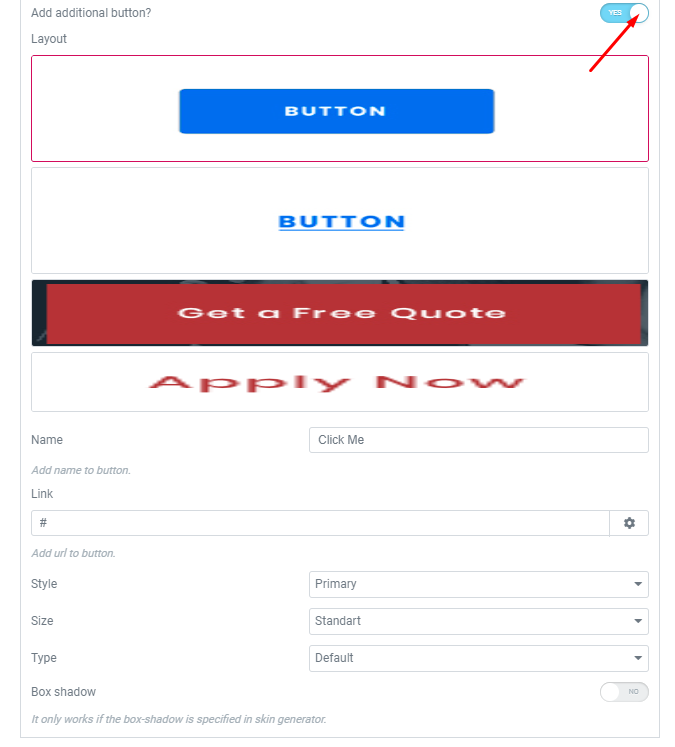
Button items:
- Layout – Please, select the button layout.
- Name – Please, enter the button text.
- Link – Please, add a URL to the button.
- Style – Here you can select the button style (dark or light).
- Size – Here you can select button size (small or large).
- Type – Here you can select the button type (reverse or transparent).
- Box shadow – This option allows you to add the box-shadow to the button. It only works if the box-shadow is specified in skin generator.
Enable creative version – Turn on the switcher if you want to enable the creative version.
Swiper Settings: #
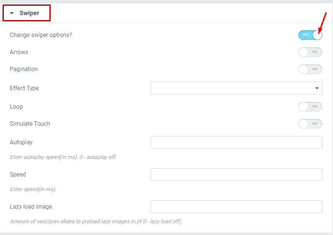
Change swiper options? – Turn on switcher if you want to change the following swiper options:
- Arrows – Turn on the switcher to display swiper in arrows style;
- Pagination – Turn on the switcher to display the sliders pagination;
- Effect Type – Here you can select from the list the effect type for swiper (Slide, Fade, Cube, Flip, Coverflow);
- Loop – Turn on the switcher to display the loop effect;
- Simulate Touch – Turn on the switcher to simulate touch effect;
- Autoplay – Please, enter autoplay speed(in ms). 0 – autoplay off;
- Speed – Please, enter speed(in ms);
- Lazy load image – Amount of next/prev slides to preload lazy images in. (if 0 – lazy load off).
HR Modern Style: #
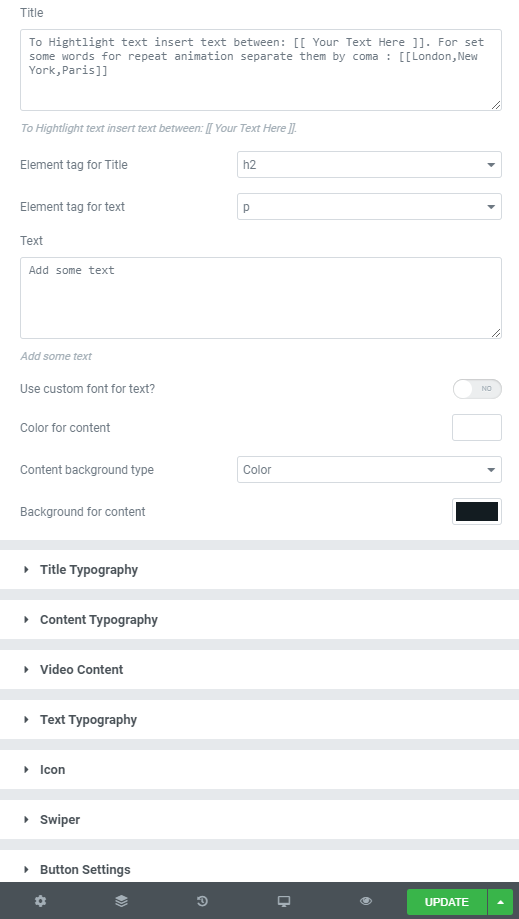
Title – Here you can add the title. To Hightlight text insert text between: [[ Your Text Here ]]. For set some words for repeat animation separate them by coma : [[London,New York,Paris]]
Element tag for Title – Here you can select a tag for a title.
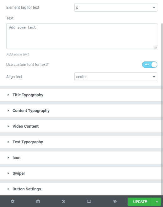
Element tag for text – Here you can select a tag for a text.
Text – Add some text.
Use custom font for the text? – Turn on the switcher if you want to customize the font for the text.
Color for content – Choose the color for content from the palette box.
Content background type – Select the type of content background (Color or Image).
Background for content – Choose the background color for content from the palette box.
Video Content Settings:
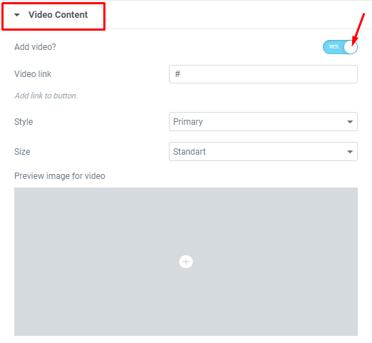
Add video? – Turn on the switcher if you want to add the video to the current content.
Video link – Add link to the button.
Style – Here you can select the video button style: primary, dark or light.
Size – Here you can select the video button size: standart, small or large.
Preview image for video – Here you can choose the image for video preview.
Button Settings:
Add button? – Turn on the switcher to add the button for current banner slide. If you turn on the switcher, there are the next items:
- Layout – Please, select the button layout.
- Name – Please, enter the button text.
- Link – Please, add a URL to the button.
- Style – Here you can select the button style (dark or light).
- Size – Here you can select button size (small or large).
- Type – Here you can select the button type (reverse or transparent).
- Box shadow – This option allows you to add the box-shadow to the button. It only works if the box-shadow is specified in skin generator.
Text Typography: #
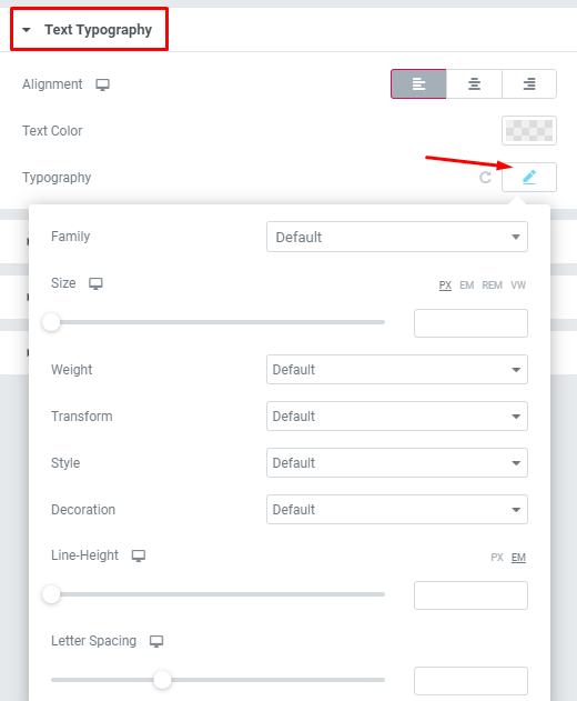
- Family – Here you can select the typography for the text.
- Size – Here you can set up the text size.
- Weight – Please, select the weight for the text.
- Transform – This option allows to change the case of the text.
- Style – Please, select text style for the text.
- Decoration – Please, select style for the text decoration.
- Line-Height – Here you can enter a line height for the text.
HR Simple Text with icon Style: #


